Graphics & Design Services teams that need Mobile app design without building the workflow from scratch.
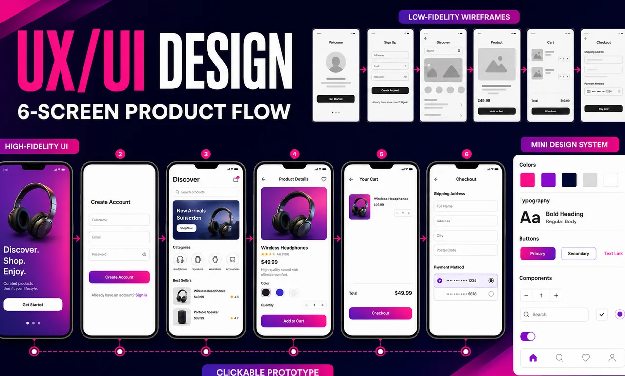
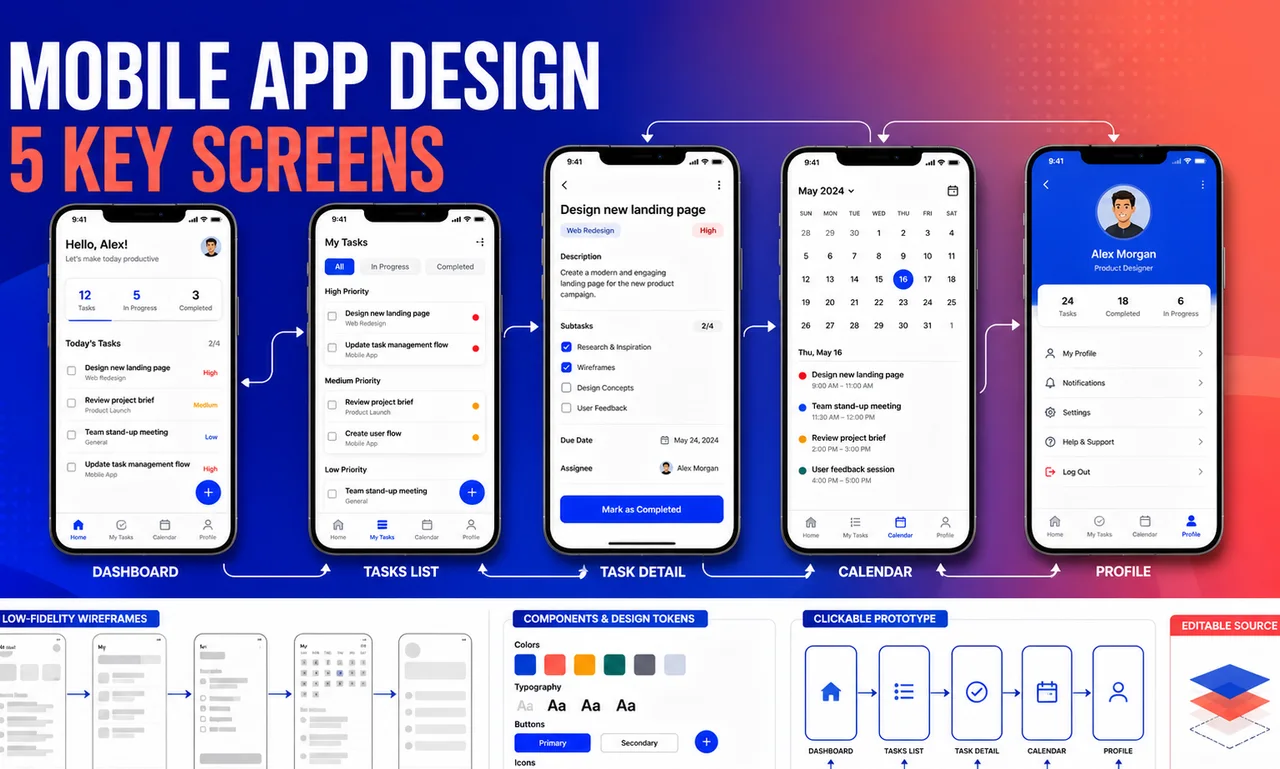
This fixed-scope mobile app design package turns one defined product flow into five key mobile screens that a stakeholder or development team can inspect and use. Work begins with low-fidelity wireframes to confirm hierarchy and task order, then moves into high-fidelity Figma UI, linked prototype interactions, a compact component set, and handoff notes. Two consolidated revision rounds are included. The package is deliberately limited to design: it excludes development, recruited research, formal usability studies, App Store or Google Play assets, and additional screens unless separately scoped. The provider delivers design artifacts and professional judgment but does not guarantee usability scores, conversion, store approval, downloads, or revenue.
Review the product goal, target user, required content, screen list, platform constraints, and definition of the final state.
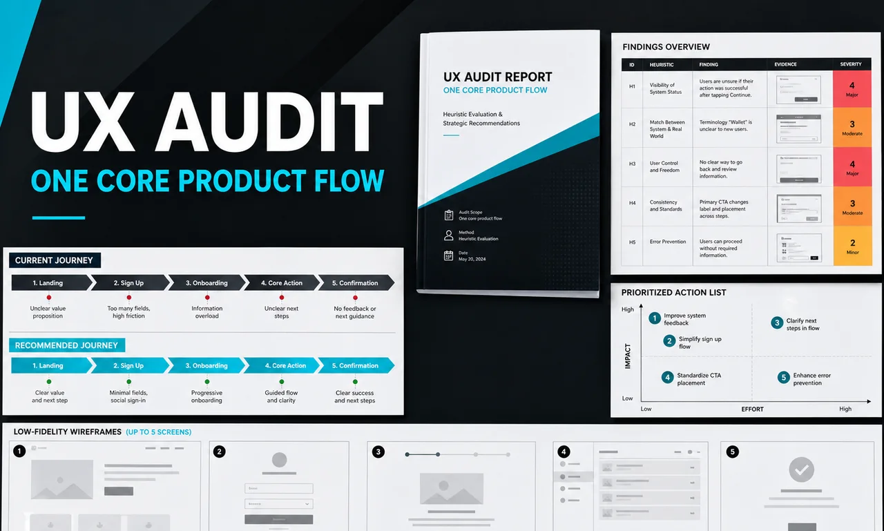
Organize the user path and create five low-fidelity frames so hierarchy and navigation can be approved before visual polish.
Apply the agreed visual direction to all five screens and build the compact reusable component set in Figma.
Link the primary path and apply up to two consolidated revision rounds without expanding the approved screen count.
Organize Figma pages, name components and frames, and add concise interaction or implementation notes for the receiving team.
Graphics & Design Services teams that need Mobile app design without building the workflow from scratch.
Operators who can provide Product summary, target user, and the single flow to design, Required actions, content, labels, and success state for each screen and Brand assets, color and typography rules, or permission to propose a direction and want a polished, implementation-ready output.
Buyers comparing packaged help for One agreed mobile user-flow map, Five low-fidelity mobile wireframes and Five high-fidelity mobile UI screens with clear scope, price, and turnaround.
| Deliverable | Format | Practical use |
|---|---|---|
| One agreed mobile user-flow map | Editable asset | Use it as a practical Mobile app design asset that can be edited, shared, and implemented after delivery. |
| Five low-fidelity mobile wireframes | Editable asset | Use it as a practical Mobile app design asset that can be edited, shared, and implemented after delivery. |
| Five high-fidelity mobile UI screens | Editable asset | Use it as a practical Mobile app design asset that can be edited, shared, and implemented after delivery. |
| One clickable Figma prototype for the core path | Editable asset | Use it as a practical Mobile app design asset that can be edited, shared, and implemented after delivery. |
| Compact color, type, button, and form component sheet | Spreadsheet | Use it as a practical Mobile app design asset that can be edited, shared, and implemented after delivery. |
| Organized editable Figma source file | Editable asset | Use it as a practical Mobile app design asset that can be edited, shared, and implemented after delivery. |
The strongest results come from a specific brief: Product summary, target user, and the single flow to design, Required actions, content, labels, and success state for each screen, Brand assets, color and typography rules, or permission to propose a direction, Reference apps and examples of visual directions to use or avoid and Target platform, device size, and any accessibility requirements. The provider uses those inputs to tune the deliverables to your market, channel, and operating style.
You receive editable assets from SpringBrand Product Design Network that can be reviewed, revised, and moved into your own tools. If the work needs platform setup, publishing, or ongoing management, treat that as a follow-on scope.
Concrete examples, scope boundaries, and notes on how buyer inputs become usable assets.
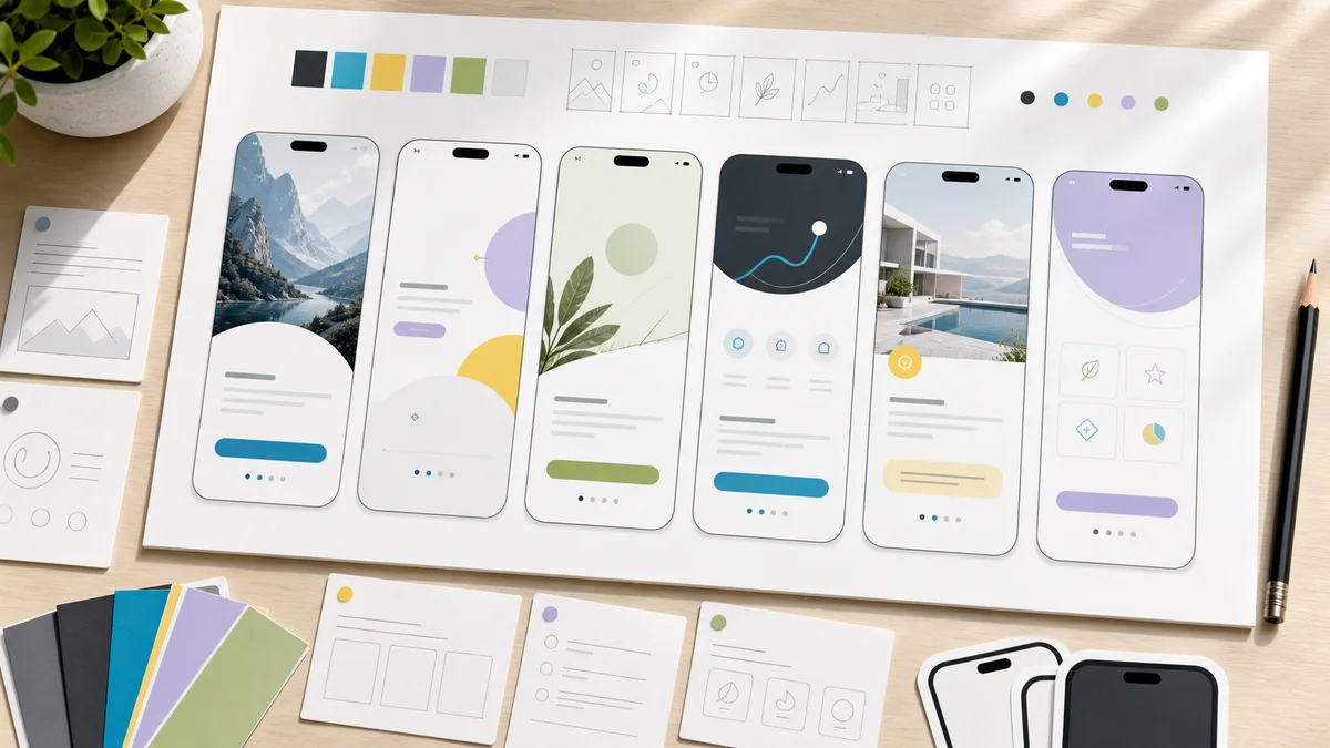
Example screen set
The handoff pairs low-fidelity wireframes with high-fidelity Figma frames, linked prototype interactions, reusable buttons and form controls, and concise notes for the development team. The exact screens follow the one agreed core flow rather than this example list.
SpringBrand Product Design Network matches a scoped brief to a product designer who can work inside a fixed screen count and handoff format. The package follows common freelance marketplace buying expectations while keeping exclusions and revision limits visible before work starts. The service is delivered independently through SpringBrand with scope and accountability stated directly on this page.
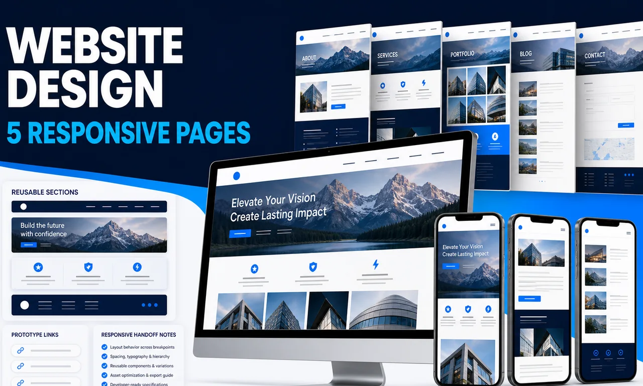
A screen is one primary mobile layout at an agreed device size. Major alternate states, extra breakpoints, onboarding branches, tablet layouts, or additional flows may count as added screens and are confirmed before design begins.
Yes. The five agreed screens are first structured as low-fidelity wireframes and then developed into high-fidelity Figma UI after direction is confirmed.
Each round applies one consolidated set of feedback to the agreed five-screen flow. A new product direction, extra screens, or feedback that reverses an approved direction requires a new scope.
No. Coding, backend work, QA, implementation, App Store screenshots, listing copy, publishing, and store submission are not included.
No. The designer uses the supplied brief and references; user recruitment and formal research are excluded. No usability, conversion, download, approval, or revenue outcome is guaranteed.
Explore adjacent services that solve the next step in this workflow.