Graphics & Design Services teams that need Responsive website design without building the workflow from scratch.
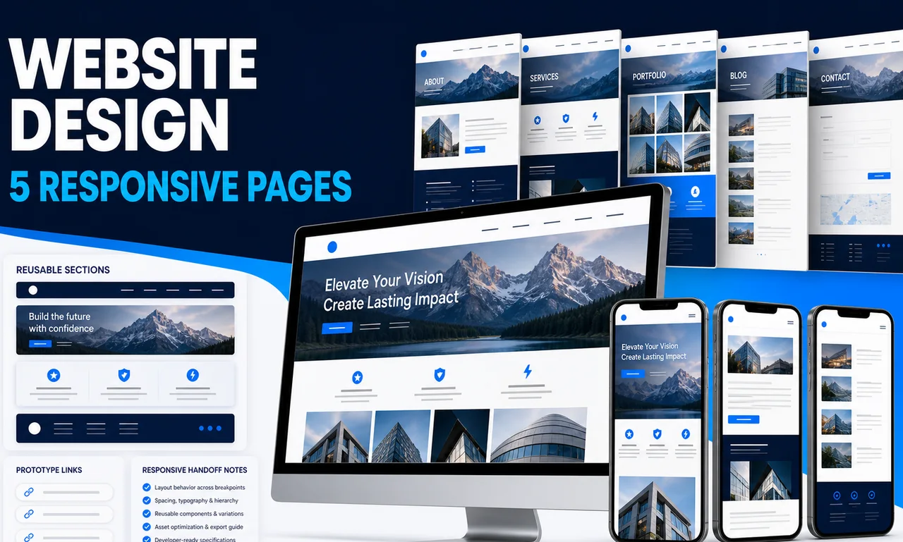
This website designer package creates a cohesive five-page website system for buyers who already know what the site needs to say but need a professional responsive layout before development. Each named page is designed in Figma at desktop and mobile breakpoints, supported by a reusable section and component sheet and a clickable primary-path prototype. Two consolidated revision rounds are included. The deliverable is design, not a launched site: code, CMS setup, copywriting, domain and hosting work, custom illustration, and ongoing optimization are excluded. The provider does not guarantee traffic, conversion, accessibility certification, launch timing, or revenue.
Lock the five-page sitemap, content status, brand assets, target audience, required sections, and development constraints.
Translate references and brand rules into an approved direction for type, color, spacing, imagery, and core page patterns.
Create all five pages at the agreed desktop and mobile sizes while organizing repeated sections and components.
Connect the primary journey and apply up to two consolidated revision rounds within the approved five-page scope.
Clean the Figma structure, name frames and components, and add responsive or interaction notes for the implementation team.
Graphics & Design Services teams that need Responsive website design without building the workflow from scratch.
Operators who can provide Confirmed sitemap and the five pages included in the package, Final or near-final page copy and calls to action and Logo, brand colors, typography rules, and existing brand assets and want a polished, implementation-ready output.
Buyers comparing packaged help for Five desktop website page designs, Five corresponding mobile page designs and Reusable website section and component sheet with clear scope, price, and turnaround.
| Deliverable | Format | Practical use |
|---|---|---|
| Five desktop website page designs | Editable asset | Use it as a practical Responsive website design asset that can be edited, shared, and implemented after delivery. |
| Five corresponding mobile page designs | Editable asset | Use it as a practical Responsive website design asset that can be edited, shared, and implemented after delivery. |
| Reusable website section and component sheet | Spreadsheet | Use it as a practical Responsive website design asset that can be edited, shared, and implemented after delivery. |
| Clickable Figma prototype for the primary journey | Editable asset | Use it as a practical Responsive website design asset that can be edited, shared, and implemented after delivery. |
| Organized editable Figma source file | Editable asset | Use it as a practical Responsive website design asset that can be edited, shared, and implemented after delivery. |
| Responsive behavior and interaction notes | Editable asset | Use it as a practical Responsive website design asset that can be edited, shared, and implemented after delivery. |
The strongest results come from a specific brief: Confirmed sitemap and the five pages included in the package, Final or near-final page copy and calls to action, Logo, brand colors, typography rules, and existing brand assets, Reference websites and examples of styles to use or avoid and Required sections, forms, navigation items, and legal links. The provider uses those inputs to tune the deliverables to your market, channel, and operating style.
You receive editable assets from SpringBrand Product Design Network that can be reviewed, revised, and moved into your own tools. If the work needs platform setup, publishing, or ongoing management, treat that as a follow-on scope.
Concrete examples, scope boundaries, and notes on how buyer inputs become usable assets.
Example page set
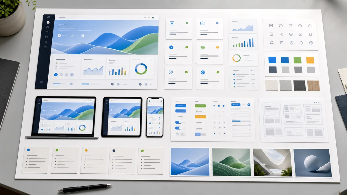
Each agreed page is designed at desktop and mobile breakpoints in Figma. Shared navigation, footer, cards, forms, buttons, and content sections are organized on a reusable section and component sheet, with prototype links for the primary journey.
SpringBrand Product Design Network assigns a designer to a fixed page count, breakpoint set, and handoff format, making the order easier to compare and manage. The package reflects common freelance marketplace scope patterns while stating what remains with the buyer or developer. The service is delivered independently through SpringBrand with scope and accountability stated directly on this page.
A page is one named page template, such as Home, About, Pricing, Service, or Contact, designed at one desktop and one mobile breakpoint. Substantially different variants or complex application states may require added scope.
Yes. Each of the five agreed pages receives desktop and mobile designs. Tablet-specific layouts or extra breakpoints are not included unless added before work starts.
Two rounds apply consolidated feedback to the approved five-page direction. New pages, a new brand direction, rewritten requirements, or feedback after final approval are outside the base package.
No. Frontend development, Webflow or WordPress setup, CMS entry, hosting, domain configuration, and copywriting are excluded. The buyer supplies approved copy or accepts clearly marked placeholders.
No. The package delivers a professional responsive design and handoff. Conversion, traffic, accessibility compliance, implementation quality, launch timing, and revenue depend on factors outside this scope.
Explore adjacent services that solve the next step in this workflow.