Graphics & Design Services teams that need UX/UI product design without building the workflow from scratch.
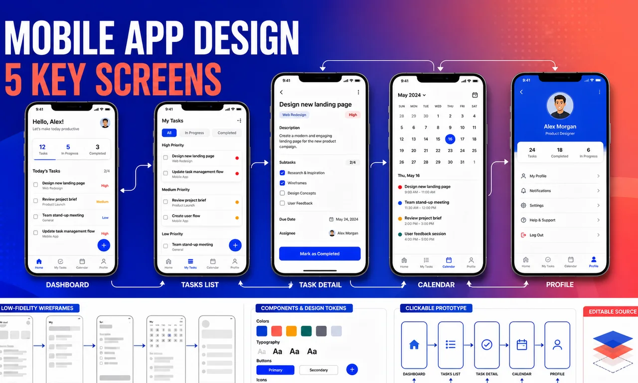
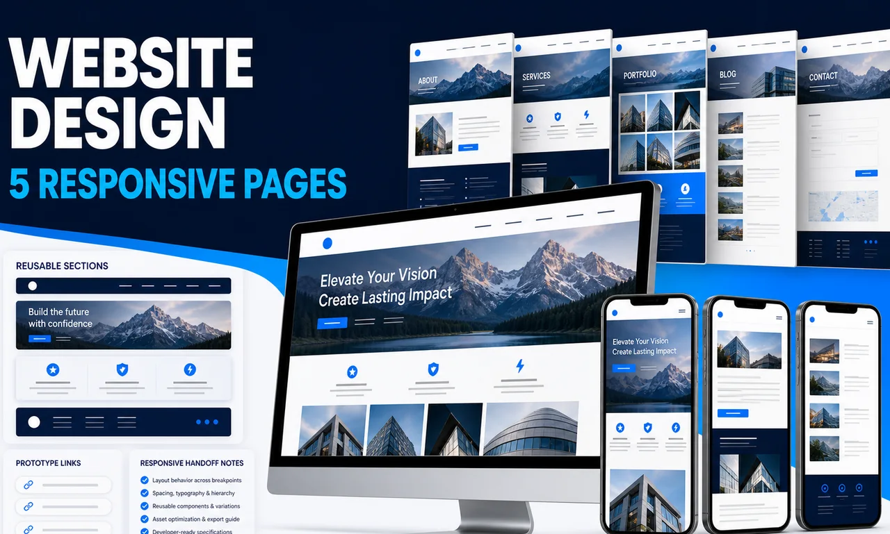
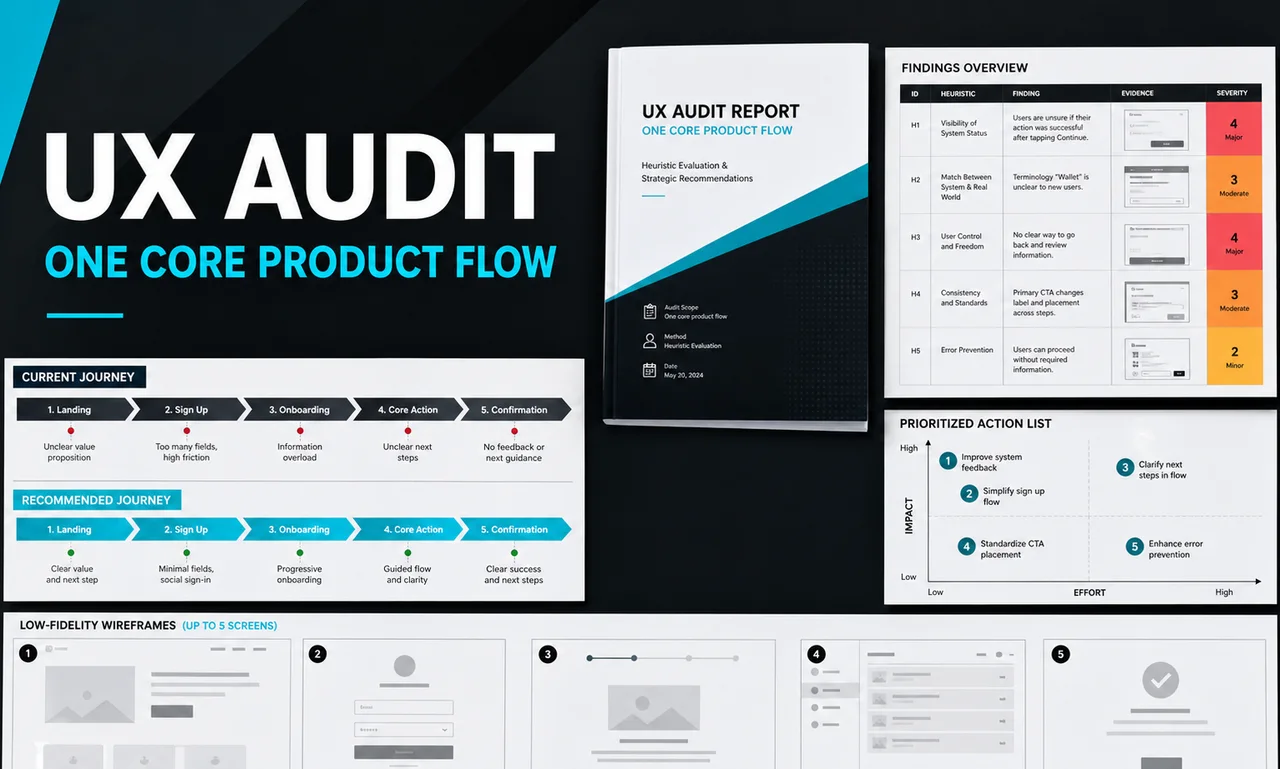
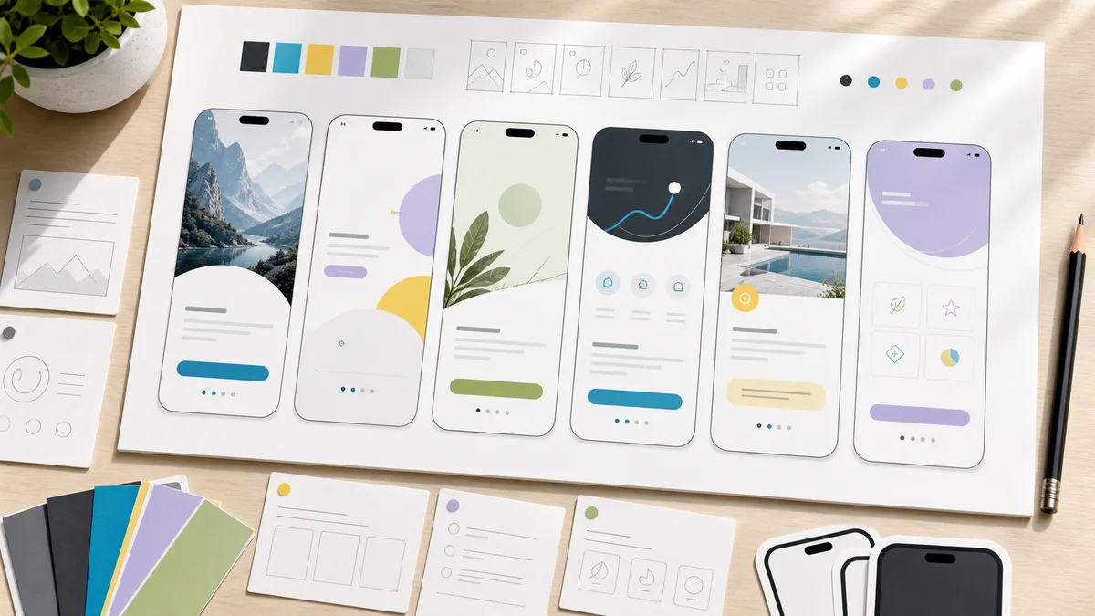
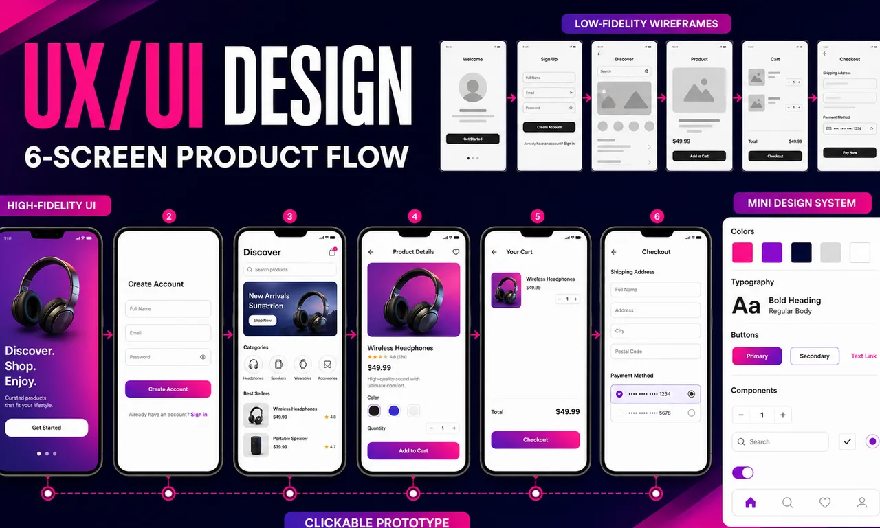
This UX/UI designer package covers one clearly defined product flow with up to six unique screens. It combines user-flow organization, low-fidelity wireframes, high-fidelity interface design, a clickable Figma prototype, and a mini design system so the experience is both understandable and visually consistent. Two consolidated revision rounds are included. It is suited to teams with a product goal, requirements, and content inputs that need to become a coherent design. Development, participant recruitment, interviews, formal usability studies, multiple product areas, and unlimited state design are excluded. The provider does not guarantee usability scores, adoption, conversion, accessibility certification, or revenue.
Confirm the user, start and end points, business rules, screen count, available evidence, and technical constraints.
Create the flow map and low-fidelity frames for up to six screens, resolving hierarchy and task sequence first.
Apply the approved direction and build the core colors, type styles, controls, and components used across the flow.
Link the primary interactions and apply up to two consolidated feedback rounds within the approved flow.
Organize screens and components, annotate important behavior, and provide the editable Figma source for implementation.
Graphics & Design Services teams that need UX/UI product design without building the workflow from scratch.
Operators who can provide Product summary, target users, and the one task the flow must support, Feature requirements, business rules, and success criteria and Existing research, analytics, or customer feedback if available and want a polished, implementation-ready output.
Buyers comparing packaged help for One defined product-flow map, Up to six low-fidelity wireframes and Up to six high-fidelity UI screens with clear scope, price, and turnaround.
| Deliverable | Format | Practical use |
|---|---|---|
| One defined product-flow map | Editable asset | Use it as a practical UX/UI product design asset that can be edited, shared, and implemented after delivery. |
| Up to six low-fidelity wireframes | Editable asset | Use it as a practical UX/UI product design asset that can be edited, shared, and implemented after delivery. |
| Up to six high-fidelity UI screens | Editable asset | Use it as a practical UX/UI product design asset that can be edited, shared, and implemented after delivery. |
| Clickable Figma prototype for the primary path | Editable asset | Use it as a practical UX/UI product design asset that can be edited, shared, and implemented after delivery. |
| Mini design system with core styles and components | Editable asset | Use it as a practical UX/UI product design asset that can be edited, shared, and implemented after delivery. |
| Organized editable Figma source file | Editable asset | Use it as a practical UX/UI product design asset that can be edited, shared, and implemented after delivery. |
The strongest results come from a specific brief: Product summary, target users, and the one task the flow must support, Feature requirements, business rules, and success criteria, Existing research, analytics, or customer feedback if available, Final or representative content, labels, and validation messages and Brand assets, existing design system, or visual references. The provider uses those inputs to tune the deliverables to your market, channel, and operating style.
You receive editable assets from SpringBrand Product Design Network that can be reviewed, revised, and moved into your own tools. If the work needs platform setup, publishing, or ongoing management, treat that as a follow-on scope.
Concrete examples, scope boundaries, and notes on how buyer inputs become usable assets.
Example flow: create and publish a project
The delivery documents the flow, creates low-fidelity wireframes for the agreed screens, develops a consistent high-fidelity interface, and links the main path in Figma. A mini design system records the core styles and components used in the flow.
SpringBrand Product Design Network matches a clearly bounded flow to a designer who can connect UX structure with finished UI and implementation-ready organization. The fixed screen count makes marketplace-style comparison practical without hiding research or engineering exclusions. The service is delivered independently through SpringBrand with scope and accountability stated directly on this page.
It is one start-to-finish user task, such as onboarding, checkout, booking, or creating and publishing an item. Separate user roles, unrelated tasks, or alternate branches may require additional scope.
The package covers up to six unique primary screens. Complex alternate states, dashboards with substantially different layouts, extra breakpoints, or added branches are reviewed before the screen list is locked.
It includes the colors, typography, spacing guidance, and core buttons, fields, cards, or navigation components used in the agreed flow. It is not a full enterprise design system or coded component library.
No. Each revision is one consolidated feedback round within the approved flow and direction. Replacing the brief, adding screens, or restarting after approval requires a new scope.
No. Code, implementation, participant recruitment, interviews, and formal usability testing are excluded. The design is informed by the buyer's inputs and does not guarantee adoption, conversion, or usability outcomes.
Explore adjacent services that solve the next step in this workflow.